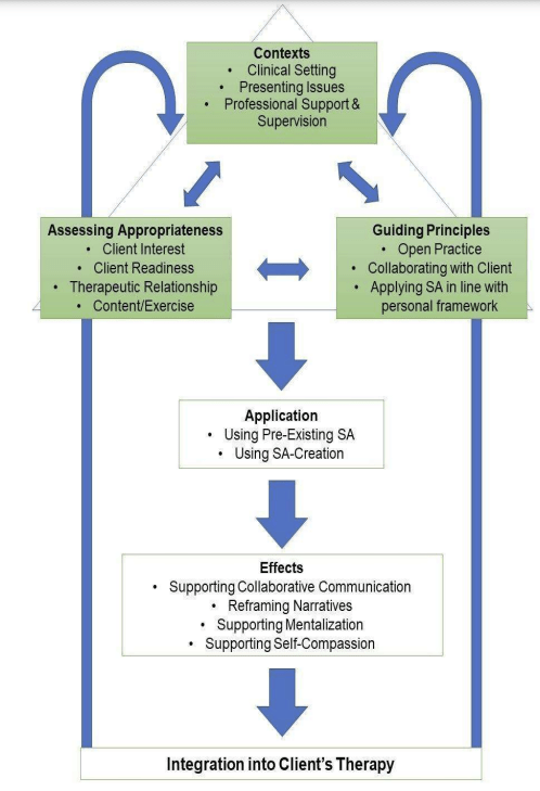
A thesis is typically long, and mine is no exception. So, I wonder to myself, where would someone turn if they wanted to get a good sense of the overall findings of my research if they only have five to ten minutes? You might start with the abstract, which provides a short summary of the whole project. But if you need more information, where do you go next? I’d suggest the diagram.
The diagram I created represents the findings of my research and shows a sequential model for applying sequential art to talking therapy. In other words, it outlines the stages a therapist should work through when using sequential art in therapy.
If you’re not a therapist, you may have wondered how therapists decide what tools to use with their clients. This diagram (and a lot of the thesis) relates pretty directly to this subject. As a non-therapist you might also be unfamiliar with terms like “intervention” and “integration”.
Intervention is a term therapists often use to describe something they do in therapy to progress the work they’re engaged in with their client.
Integration is a term that gets applied in more than one way in psychology and psychotherapy, but generally it refers to a bringing together of multiple parts into a coherent whole.
Client while we’re defining terms, “client” how a lot of therapists describe the people they work with. Some therapists prefer the term “patient”. I use “client” for reasons I can perhaps go into another time, but generally speaking these terms can be considered synonymous.
Now that we’ve covered that, we can get back to talking about the diagram.
What’s the big deal about a diagram?
In a research-based project like mine, the diagram represents the main finding. Not all research projects have them, but if your findings lead to a model that captures (or tries to capture) all your results, a diagram is a very useful way to communicate this information.
You could think of it as the project’s TLDR. In one image you have a distillation of what the project has found, and how it works. When executed well, a diagram can present thousands of words’ worth of information in a single image. That’s why it’s such a good second stop after the abstract to get a quick feel for what the research findings are saying.
What does your diagram say?
Let’s have a look at it. The diagram reads from top to bottom. At the top, we have three categories that influence each other. These are subjects the therapist must consider before planning an intervention using sequential art. In therapy, when we talk about an intervention, what we’re talking about is an action that we take with the intention of leading to some sort of change. Therapy is all about helping to facilitate change, so these interventions are a big part of the work a therapist does.
Moving down the diagram we can see that the interactions of these three things are coming together to influence a decision. The therapist, having considered all the important points, now believes that an intervention using sequential art would be useful for their client. Next they must decide what sort of intervention is the best fit. Would working with pre-existing sequential art be more appropriate than working through the creation of new sequential art with their client, or vice versa? They might even consider a combination of some sort to be best. This stage is about selecting the right intervention for the client.
Whatever decision the therapist makes, it brings them to the next stage: observing and assessing the effect of the intervention. They’ve finished the intervention, and now they’re learning with the client about its impact.
The “final” stage is the process of working this smaller piece of work into the overall therapy, integrating it in other words. If we think of the intervention as zooming in with a camera to focus on something specific, integrating involves zooming back out to see how it fits into the full picture.
Why is this stage “final”? Because the therapist might decide that another intervention using sequential art could be beneficial.You will have noticed the arrows that come out of the final box in the diagram. These arrows indicate that after the intervention has been integrated into the client’s overall therapy, if the therapist feels another intervention using sequential art might be useful, they should return to the beginning of this process.
The therapist must consider, select, observe and assess, and finally integrate all over again. Why? Every intervention is its own unique act, and as such it needs to be carefully approached each time so that it is safe and beneficial for the client.
Remember that any intervention is intended to contribute to change. If an intervention has been successful, then things might not look exactly as they did before the previous intervention. Something very important might be different, so the same care has to be taken with a new intervention as with the first one.
So, your diagram just focuses on clinical application?
Yes. Although the thesis covers various areas, including previous literature, research methodology, and implications of the findings, its main focus is on clinical application. This project was always about what happens in a therapy room between a therapist and their client.
My assumption would be that most of the people who would take an active interest in this piece of research are likely to be other therapists interested in learning more about the clinical application of sequential art.
Diagrams have limitations, so you can’t get a full understanding of a 200-page thesis just by looking at it. For example, someone might wonder what “open practice” means. For answers, they’ll need to read further. However, the diagram, along with the abstract, provides a good starting point for understanding the overall project.

Leave a comment